From the research I had already gathered by previous tasks I decided to refine my visual metaphor to a shivering spine. From reflecting on memories of fears me and my peers have had and feelings in which poems about fear seemed to be portray, the idea of a fear, no matter what it is, it sending a chill down your spine became a very reoccurring factor to me. I have learnt that the idea behind a visual metaphor, is that you don’t want to directly illustrate what it is as it is then no longer a metaphor and more rather just an illustration.
I started my process of producing outcomes by doodling different ways in which I could represent this sensation of a shivering spine. The most universal way in which I could do this was by doodling lines around the outline of the spine itself, however I struggled with finding different ways in which I could communicate this idea.
I started by looking into the illustrations of Quentin Blake, although an obvious illustrator to research, his use of scribbly lines was something that particularly interested me as it creates a sense of movement within his work. When looking through the imagery in which he has produced I found that the illustrations for the book ‘The Twits’ related quiet well to the theme of fear.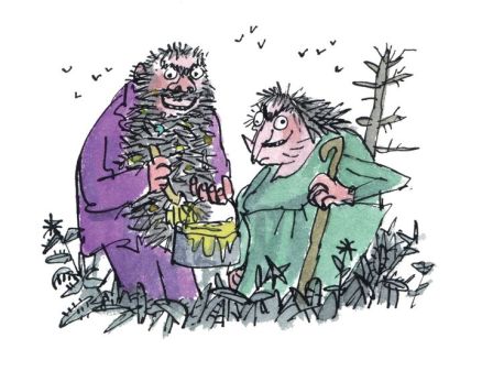
The colour platte used throughout the illustrations reflected the disgusting nature of the characters in the book. Using muted tones and mixing colours to create sort of muddy outcomes. When comparing his colour palette here to the colour pallets I made previously in response to my own fears I noticed that a lot of the same colours occurred throughout both. When thinking about my own work, I wanted to use this sense of movement he creates due to his quick style brush strokes, to create the movement of a shivering spine.
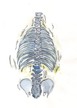
Using a line liner I quickly, without restriction illustrated a spine in the style of Quentin Blake, I found the looser the hand when doing this the better the result. To make it more obvious that the spine was in movement, I went on to put marks around the outside to show vibration of the skeleton. When thinking about colour and referring back to my pallets, I decided to use muted blues and greens and like Blake, layer the colours to create a somewhat muddy effect. The different tonal values of the picture I believe again deepens the message of it being shaken as well as strengthened the metaphor as fear being dark, doom and gloom.
Rob Ryan is my second artist in which I reserached as I wanted to create more interest in my work and produce some work that was more than just illustrations. The detail in which Ryan puts in his work is very impressive and something that I wanted to attempted for myself. The colour use in his work is very simplistic and limited however this interests me as a lot can be taken from the image emotionally due to the colour thats used.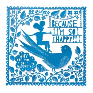
As the sense of movement was hard to construct when cutting out of paper, I tried to make the lines of vibration more prominent in the image. The light blue background to me, really gives a sense of being afraid and almost shocked. I believe this image could also be read as someone by fear freezing you in the moment, although it is not the metaphor I am attempting portray, it still works well as a slightly different visual metaphor.
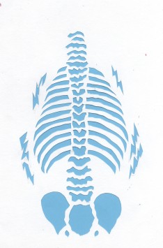
Taking my original sketch into photoshop I then wanted to play with layering the image of the spine with different opacities to create more movement. Although I could not find an artist who had played with this idea, I began to try it myself anyway.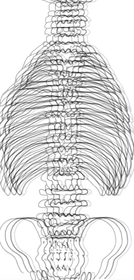
By changing the opacities of the layers and slightly moving each layer left and right, I believe it is effective in creating the impression of a moving image. Feedback from my peers about this piece was very positive, it was widely thought that this communicated the idea of a shivering spine well and worked efficiently as a visual metaphor for fear as many knew what theme it was relating too immediately. Although the colour scheme is limited here, I didn’t want to mess around with it too much as it is a busy image as it stands.
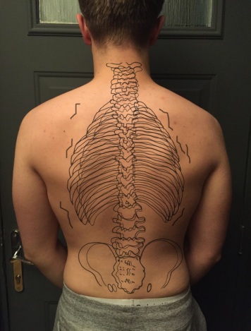
Finally I took inspiration from a lot of artwork I saw on Pinterest such as the one below and the work of artist Johan Thörnqvist, all whom take photographs and illustrate over the top of them.
With this in mind I really wanted to experiment with the spine I had just created. Layering it over my own photography of a bare back. Again I think this worked quiet well however on reflection I could have taken this image further by playing with the colour of the image itself, although the colour palette is dark and to me does reflect fear, the colour of the back itself almost looks to bright to have chills being sent down its spine
 When getting back into our groups we spent the time giving feedback to one another about our images and began discussing how we can present each of our images in a thematically and coherent manner to create a zine. We discussed which each of our outcomes worked best and had been most successful.
It became clear that we all had used a similar colour palette in our work so we tried to group images together that would flow on a page.
For the front page of the zine we decided to have a simple full black page with small white writing of a quote from a poem by Savannah Brown. We communally decided that this would make quiet a statement and be a strong communication of fear as fear in our perceptions makes us feel small (like the text) surrounded by darkness. We also thought that by using a plain background it wouldn’t detract from the work itself and would make the words of the poem more powerful. I think our zine worked well to communicate the idea of fear through visual metaphors, i really enjoyed how this project has made me think about illustrating and presenting work in different ways and how work can be perceived differently by the viewer. I also enjoyed experimenting with different ways to present my work such as paper cuts and photography. From the feedback it was made clear that in future projects to perhaps think about the composition of layout more and perhaps play with size.


After presenting our work in our formative assessment presentation a couple points were brought forward to how we can improve our zine. The artwork inside and the communication of fear as the message was well received as the images were said to clearly explain the theme and the meaning. However firstly the layout of the zine needed a bit of work, with images both portrait and landscape, the zine was constantly needed to change angles in order for the viewer to see the images. The boarders around all the images were also said to take away the from the power of the images themselves. It was also commented that size and composition could be played with more in order to build on a story which continues throughout the zine.
When updating our zine we decided to use the bird and the person in the landscape as the story to our zine and use the skeletons to reflect the emotions of the fear. We started of by creating a new front cover, still wanting to use the powerful words from the original poem, I then recreated my paper cut and did it on black card with the skeleton coming through as white. The darker colours we use here helps again to translate fear very easily. We want to give the images more space instead of trying to crowd a lot onto one, on the second page when opening the zine we decided to use the paper cute of the bird as a red double page spread. Again with the red colour being very relevant to fear, the image of the bird blown up and swooping down causes fear and begins our narrative and flow to the zine. On the following page the decision was made to use the water colour of the skeleton spine to reflect the feeling after seeing the bird on the previous page as the imagery of the shaking increases. We placed this next to two landscape works in which Katie did as the colour combination of them all complimented each other nicely and the image on the top on contrast to the image on the bottom, again can be seen as increasing fear as the image and colour gets more intense. On the next double page spread we all decided to place the most intense picture of the chills going down the spine in the middle. In our discussion we decided that the singular image was enough by itself to translate the feeling of fear so we wanted it to stand alone. On the following page again we wanted to show the bird again swooping down but now more visible, by placing the illustration at the bottom and making it small, it gives the sense of fear, or the bird in this sense, hanging over you. The final double page spread we wanted to again have the bird in red filling the whole page, as it now covers almost the whole of the double page it gives the impression that the bird (or fear) is now here. To sum this all up we wanted to show the emotions of fear in context, by using the image of the shaking spine placed on top of the body. We made sure that the images were full bleed as we didn’t want to stray away from the intensity if the imagery used. Unfortunalty when discussing compositions me, Katie and Cary’s had to make the decision to remove Betty’s contribution of the snake. Although a hard decision to make, I believe the removal of it has made the story and repetition of imagery stronger and therefore the zine more powerful overall.


I am very pleased with out final zine. I believe the changes in which, me, Cary’s and Katie have made since our first one has improved the zine and our message drastically, the slight narrative in which we attempt to portray works well in bringing all the imagery together to work as one and flow thought the zine. The dark front colour and used of red again relate well to thoughts relating to fear. By binding it together and allowing all our images to bleed right to the edge make the overall finish of the book, look a lot more finished and together unlike our previous version.
Resources:
