I went right back to the drawing board to redesign my dissertation design and began to look at successful editorial designs rather than getting caught up in the idea of the final product, which is what I think hindered myself last time. By looking at this helped redirect my thoughts on how I wanted to tackle this design. I began to think back to my ISTD and tried to apply all that I learnt from that to this dissertation editorial design.


I wanted to begin to move away from the idea of a brand guidelines and present my dissertation as a simple book that was type set well, trying not to overcomplicate myself. As my design evolved I began to attempt to evoke a sense of a magazine layout. This I thought worked well in reflecting the sense of consumerism mentioned throughout my dissertation, as a magazine is often somewhere which is filled with many advertisements of different brand, whilst still dealing with a large amount of content.
As the design could no longer be printed, I wanted to somehow differ each chapter to reflect which branding tool it was referring to, creating a system throughout the design. In my first chapter I discuss emotional branding. one of the main tools within emotional branding, is the idea of humanising the brand is that the consumer feels some sort of emotional attachment to the brand and therefore becomes loyal towards it. This idea of humanising was something I thought could be quiet fun to play with throughout typography. To do this I created a title page for emotional branding and began to manipulate the text by adding hands and faces to each letter. This was a playful attempt of evoking a sense of the content through the use o typography and I believe it worked well as an effective system in my design. I decided to use blue as the main colour in the emotional branding design as it is the colour people most associate with emotions as well as being calming and happy.

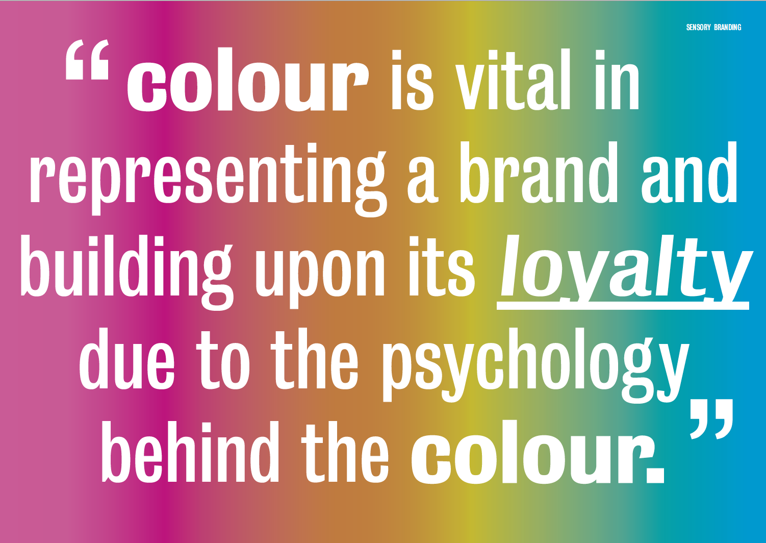
When thinking of emotions, I thought of flowing lines as a way to resemble this, therefore took this concept to work as call out in my design, filling the important words to give it a sense of hierarchy.
When it came to sensory branding, I was unsure on how this could be achieved. Originally when thinking about a printed outcome I wanted to play with textures and smell to evoke the senses in a way that is talked about throughout my dissertation. However, now being unable to do this, I went to the use of bright colours to evoke this sensory reaction.
After my initial feedback with David it was encouraging to hear that my design had come on leaps and bounds since my submission before easter. It had become a lot more thoughtful in the way I had designed it and this was evident in the outcome. I began to bring in some of the skills I learnt in my istd and introduced running heads, call outs, strike throughs and highlights to create my design.
Moving forward it was suggested in my feedback to use images that can evoke a sense of texture, in the sensory chapter of my design. This is something that I think really helped elevate my design to the next level and again helped evoke a stronger sense of the text, I worked on layering text over crumpled paper, and bringing the design into photoshop to give the outcome a sense of realism. I think this works really well.


This idea also helped me think to different ways I could represent the brand that I was mentioning. When It came to mentioning the apple brand, it was important that apples clinical and minilaisitic look was shown in my design. To do this I tried to recreate an apple advertisement as a way to show a call out within the design.


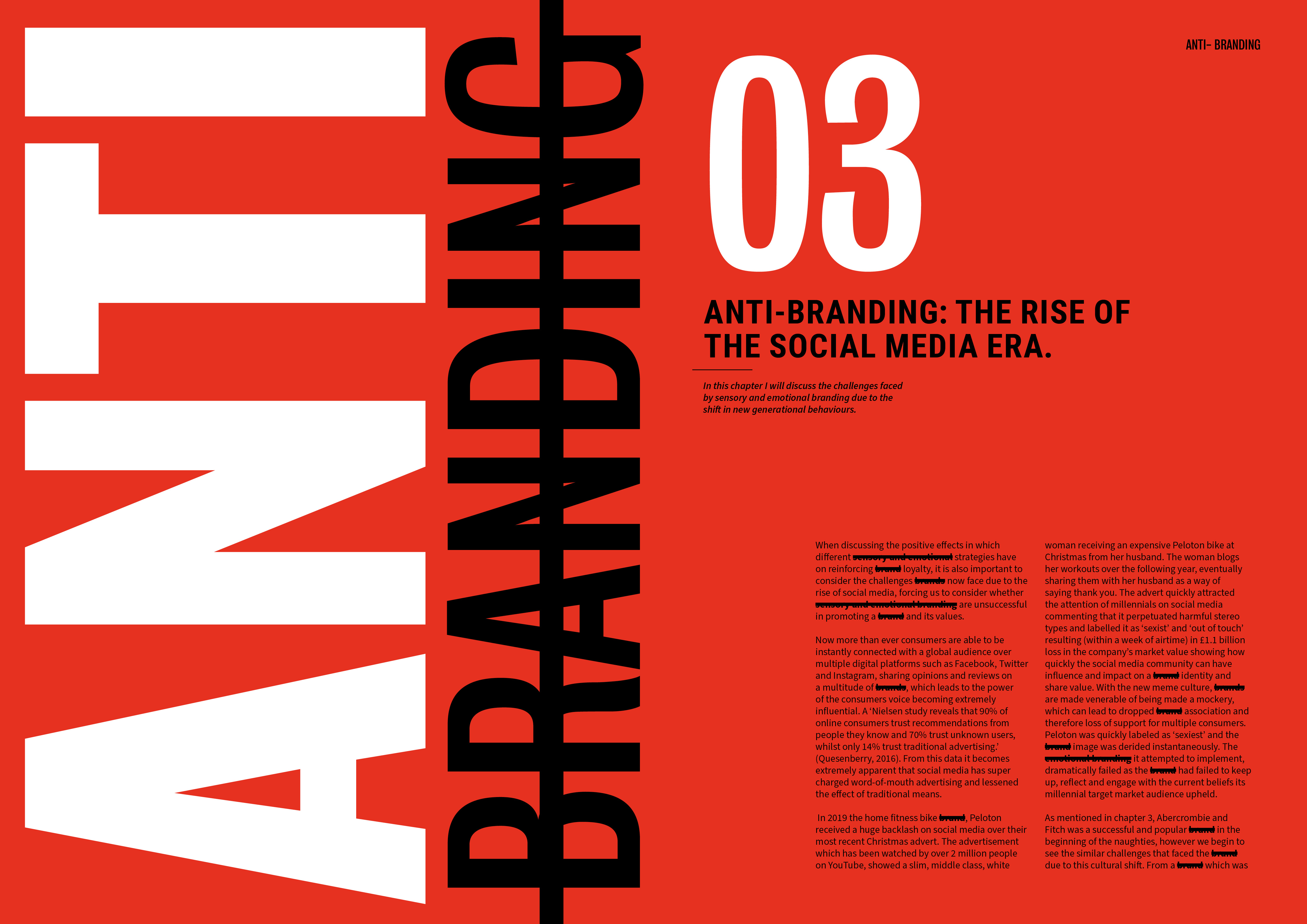
For my final chapter in which I discuss the anti-brand movement and the concepts which surround it that state how branding itself is rendered useless in society today. I wanted to to stand out on its own as almost an angry attack on the branding world. to do this I made the background red and used strike throughs to cross out the words brand to evoke this idea of anti branding. I believe this chapter of the design is a successful contrast of the first two chapters and their aim. It acts as a sort of rebellious reaction to the strategies which I think the colours used help to show, with the hierarchy of the word ‘anti’ directing our eyeliner straight away.

One of my biggest challenges when designing this was the involvement of photography throughout. As a means of examples to show these strategy, photography had been used throughout my dissertation publication, however the clinical diagrams and stock images, made it a challenge for the design to flow together as one.
Overall I am so so pleased with the development of this editorial design and I believe it has become a great piece for my dissertation. It has reaffirmed the skills I have learned throughout my istd project and successfully evokes a sense of the content throughout the design. It is something that I would love to get printed myself to keep as a symbol of my hard work in the writing and designing of it as a final product. When comparing the first draft to now it is clear to see the ambition to push the design to be successful and shows how I have come on leaps and bounds as a designer.