To start of my book design, I decided to go for a portrait A5 book, I wanted to go for a5 as I didn’t want the book to be to big or over powering as I wanted the text to be the main attraction to the book and not the size of it itself. To start of I struggled with my ideas of how I could present the ideas it which I have interpreted the book to represent.
My main ideas in which I found were the most important to chapters 1 and 24 of Frankenstein were as follows:
- Ideas of love and hope within the first chapter
- the contrast to the second chapter in which is filled with revenge and hatred
- feel of isolation all throughout the novel
- the idea of struggle throughout the final chapter
- idea of death in the last chapter in contrast to life in the first chapter
From this I also decided that I want to use the colour red as my single colour use throughout the whole design. My reasoning for this is because red is a colour in works well in representing both life love and also death. The choice of red will allow me to use it in both there first and last chapters but both holding different meanings in which I believe is an exciting concept.


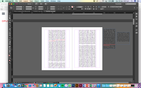
I began designing with a confused idea to how to achieve my goal, by placing the text in the page, I firstly started by using the red colour to highlight the word in the first chapter in which showcased this feeling of love and warmth. I then justified my text left and tried to show the idea of isolation by shifting it in fully justified text to the left of the page, to show how it was out of sorts to the other text, however this looked odd and didn’t flow well within the page. My next idea was to isolate the text within the middle of the page to show the isolation within this paragraph of text however again the overall layout of the page doesn’t look appealing. The idea of isolation within the text however still seemed appealing, when thinking about the whole novel it becomes clear to me that the whole novel plays with the idea of isolation throughout and not just specific parts, in the first chapter even though it is filled with love, isolation of people such as Beautford and Victor as an only child still shine throughout and is reflected in the final chapter where the idea of isolation increases. I decided on a 6 column, grid system that allows this to work well on the page.
 Because of this, I decided the best way to communicate this was to fully justify all of the text throughout chapter 1 and 24 tightly within the middle of the page as shown above. I believe this works very well in translating the story and mood of the novel efficiently.
Once I figured out my main layout I wanted to decide on the systems I would use throughout the text to allow it to all be uniform and for every layout to have a reasoning for it. For the quotes in which I deemed to be negative within the first paragraph, I wanted to make big and bold to show that even through the “positive” chapter, negativity still shines through in which is reflective to the last chapter where the bold and negative quotes with increase. I wanted to use the red to showcase the positives also and show how the red that highlight the hope in the first chapter change into revenge in the last chapter. My idea for these positive red quotes was to allow them to expand out the justified text to show how these parts are not isolating and therefore hopeful, compared to the rest of the text.


I decided to isolate a quote alone on a page to play with its importance.

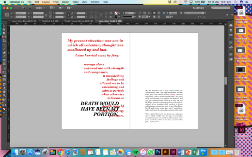
Here I again wanted to play with a quote and its importance, here at the beginning of the last chapter, the first sentences opens up to set the scene of the helplessness that surrounds it., I wanted to have the text in bold and in red and separated the sentences from each other to build the tension when it is read. I also wanted to repeat the last sentence in capitals to again show the state in which Victor Frankenstein has got himself into.


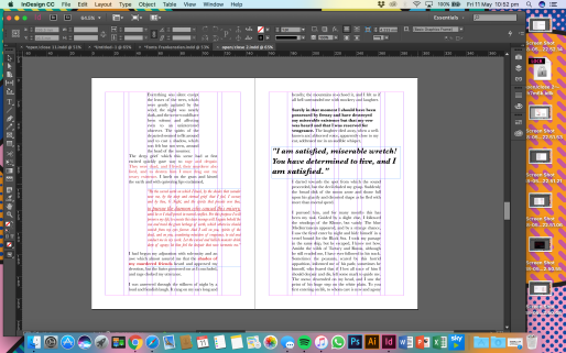
Here I justified the speech to the left of the page so that it stood out as different to the rest of the text, I also coloured the text red, in this case to show the theme of revenge. As we can also notice here, I isolated text more, within 2 columns instead of the standard 4, to show how this part of the text was even more isolating to the rest of the text.